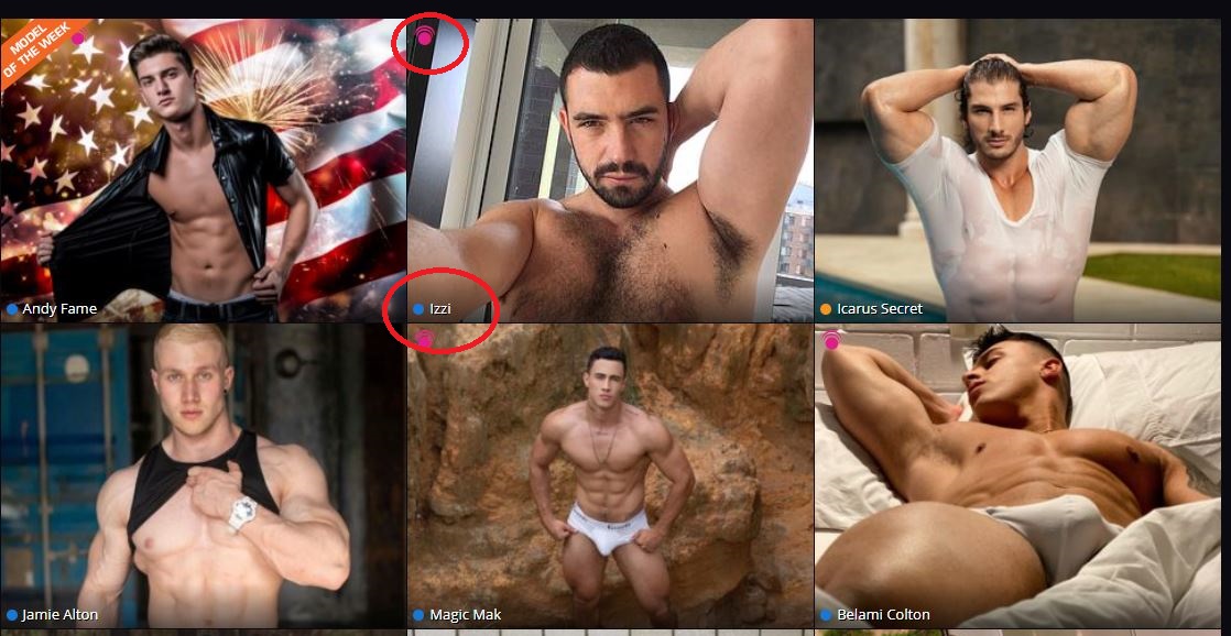
First, we've greatly reduced the amount of text you'll see when you browse the main page. This will let you see each model's bio pic or preview their room without clutter. The model's name now appears as unintrusive text. The colored dot next to it will let you know if they’re in open chat (blue), premiere chat (gold), or any other room state. (pink still means party chat, yellow is group show). The interactive icon in the upper-left corner of each pic will let you know if each model is interactive-enabled and what device they have ready to use.
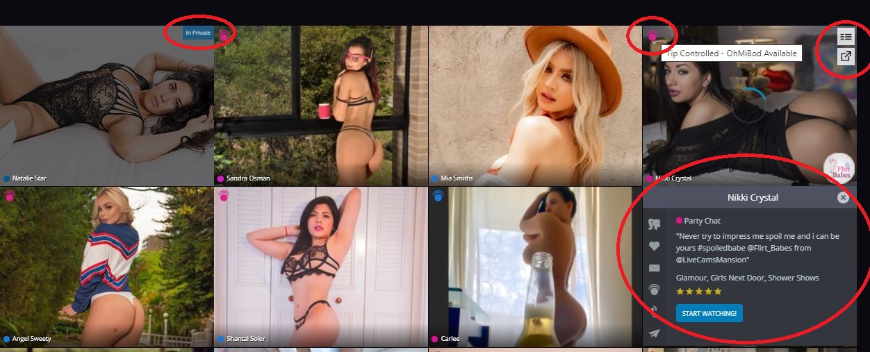
As before, if a model is in a paid show, their image on the main page will be slightly grayed. We've also added a small room-state tag to let you know if they're in private.
We've changed the model-info flyout into a simple dropdown too, to make it cleaner, and give you more info at a glance. You can add them to favorites, send them a message, turn on email notifications, or jump straight into the models room from this simple menu.
To open this dropdown, click on the options icon on the top right of each profile image. You can also enter a model's room in a new browser tab by clicking the pop-out icon beneath it.
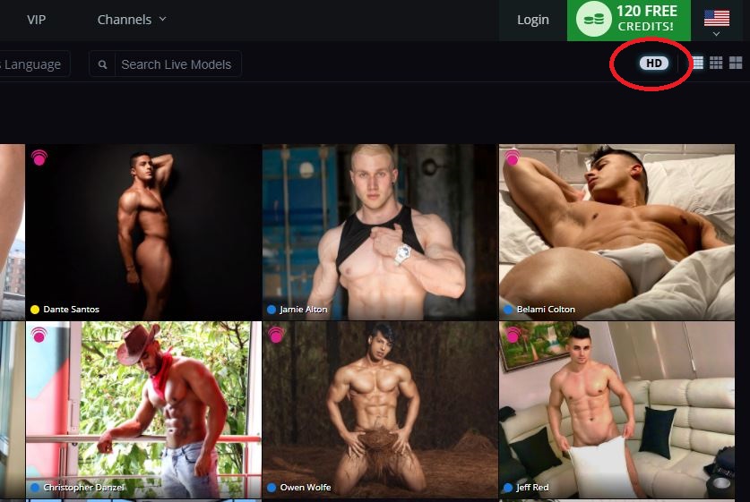
We've added a High Definition option, so you can see each profile image in its highest-quality form.
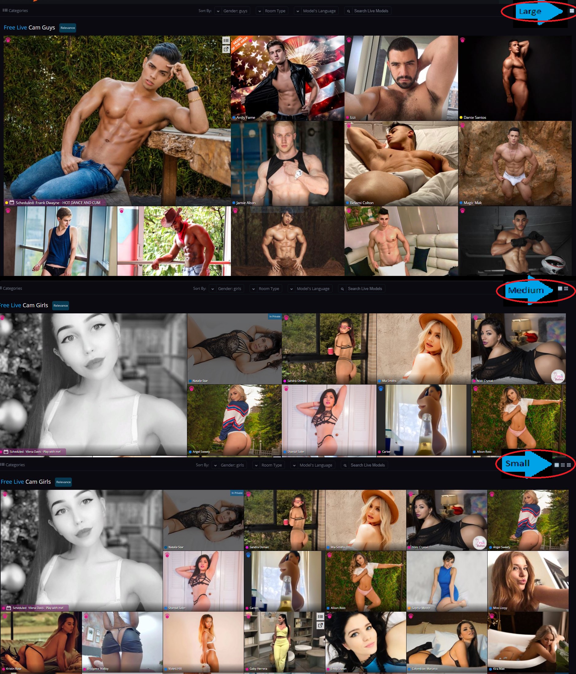
We've also added a new option that lets you decide how you browse. When you log in, your view of the main page defaults to the Largest setting. By clicking the tile buttons in the top right corner, you can reduce the size of each profile image, and browse more models at once. There is a medium setting and a small setting for maximum Flirt efficiency.
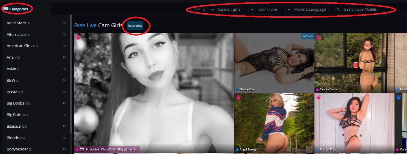
Ok, you're done browsing, and you want to pare down your choices to suit your tastes. We’ve made this experience quick, easy, and intuitive. First, we've relocated the Categories button to an expandable menu. We've also added a number of other search parameters. Search by gender, Room Type (such as party chat, group show), and view only new models.

See only models that are currently online and suit your specific needs. Clicking any category will add it to the filter bar so you can zero in on the right model for you. Simply click the "X" to remove the filter.
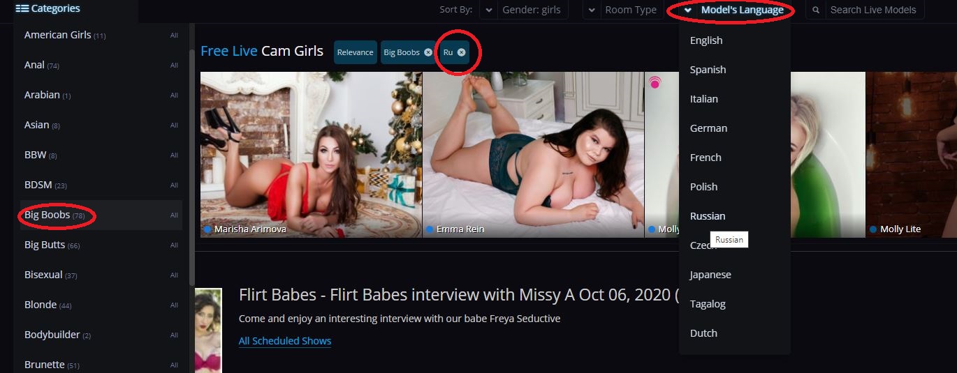
If you want to avoid a language barrier, or if you prefer your dirty talk in a specific dialect, you also have the option to filter by language, as shown above.

You can also add a name filter when you're looking for a very specific special someone. Type the name, and choose a model from either the drop-down suggestions list or from the profile images of those who make your search results list.
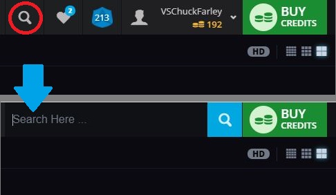
Finally, you can still search the site as before. We briefly moved the site search window to the "My Account" dropdown as part of our redesign. You'll be pleased to know that is now in the top bar once more. Simply click on the search icon to open the text entry field.
We hope these changes make for a more intuitive, enjoyable site experience. This sleek new design and updated search and sort should help you get into the action quickly. And please, share your feedback, questions, or concerns in the comments section below this post!
For a catalogue of other recent changes, check out the Site Updates section of the Flirt4Free blog.
Quote

Thanks for the feedback. Our thought was to treat those filters the same as the other filters but we'll go ahead and switch it back to how it worked before as we can see how that could be a better experience.
Quote
The interactive icon for devices does not currently display anything when clicked on for me. I would love to see what type of devices a model or models have available. Right now it's not working. Also like before there should be a noticeable difference between tip controlled and interactive.
Since the trend seems to be an increase in symbols to represent things over words (not sure how well that will be received) it would make sense to differentiate the availability of multiuser, private, exclusive private, combos in those symbols along with party, group, and fan club only chats. Also display the broadcast aspect ratio because despite some cams supposedly broadcasting in HD it is terrible finding out later the actual aspect ratio (listed as size) is 852 x 480 or 640 x 360 or something else less than 1280 x 720 which make them not high definition. Granted 1920 x 1080 is real HD and it would be fantastic to see that show up more often instead of the lower 1280 x 720.
Alright so the phrase "Room Type" should be the notable features of a room: a chair, a couch/sofa, a bed, a shower/bath, a dance pole, full length mirrors, a fucking machine, a well equipped room for bdsm, etc. Additionally it would be nice knowing without having to ask if it is possible for the camera to be picked up and moved to a different spot in the room, if the camera has zoom capability, and autofocus as well. Quote

Yes, only desktop currently but we will look into updating that mobile "jumping" experience for you as well.

The interactive icon for devices does not currently display anything when clicked on for me. I would love to see what type of devices a model or models have available. Right now it's not working. Also like before there should be a noticeable difference between tip controlled and interactive.
Since the trend seems to be an increase in symbols to represent things over words (not sure how well that will be received) it would make sense to differentiate the availability of multiuser, private, exclusive private, combos in those symbols along with party, group, and fan club only chats. Also display the broadcast aspect ratio because despite some cams supposedly broadcasting in HD it is terrible finding out later the actual aspect ratio (listed as size) is 852 x 480 or 640 x 360 or something else less than 1280 x 720 which make them not high definition. Granted 1920 x 1080 is real HD and it would be fantastic to see that show up more often instead of the lower 1280 x 720.
Alright so the phrase "Room Type" should be the notable features of a room: a chair, a couch/sofa, a bed, a shower/bath, a dance pole, full length mirrors, a fucking machine, a well equipped room for bdsm, etc. Additionally it would be nice knowing without having to ask if it is possible for the camera to be picked up and moved to a different spot in the room, if the camera has zoom capability, and autofocus as well.
Thank you Zuzar for your detailed thoughts.
To answer a few of the issues you brought up:
- if you hover on the interactive icon, it will tell you what device the model has - this hasn't been updated - for example "Tip Controlled - OhMiBod Available" is what I see on one I just tried. Please let us know if you don't see the same.
- Nothing changed with the different tip controlled vs interactive also - a model with 2-way interactive used to have a purple banner that said as much and now it's a purple icon and you can see device on hover. If you cross-reference with the interactive page you should be able to compare and see the same but let us know if you don't for some reason.
- The HD option at the top provides high resolution images or not for the homepage images and isn't referring to the video quality. We'll definitely take your ideas on video quality filtering/sorting into consideration however as we do understand how it can vary.
Thanks for the other suggestions as well! Quote
Yes, only desktop currently but we will look into updating that mobile "jumping" experience for you as well.
Awesome and thank you! Another thing I like is when we sort by room type it includes our favorites in the sorting below favorites. That makes things easier when you have a lot of favorites and are color blind lol. Thanks!!!
Quote
Thank you Zuzar for your detailed thoughts.
To answer a few of the issues you brought up:
- if you hover on the interactive icon, it will tell you what device the model has - this hasn't been updated - for example "Tip Controlled - OhMiBod Available" is what I see on one I just tried. Please let us know if you don't see the same.
- Nothing changed with the different tip controlled vs interactive also - a model with 2-way interactive used to have a purple banner that said as much and now it's a purple icon and you can see device on hover. If you cross-reference with the interactive page you should be able to compare and see the same but let us know if you don't for some reason.
- The HD option at the top provides high resolution images or not for the homepage images and isn't referring to the video quality. We'll definitely take your ideas on video quality filtering/sorting into consideration however as we do understand how it can vary.
Thanks for the other suggestions as well!
I use a touchscreen so that's probably why I didn't realize the device info was not an update since hovering isn't an option for me. I do see the purple icon though.
HD images on the home page? That's interesting, I'm often disappointed by the poor representation of models thumbnails and not because of the image quality of those thumbnails. While some models do look the same when broadcasting as in their thumbnail there are those who do not. These images provide a first impression and that will determine whether or not I want to look at a profile or enter a chat room. Aside from physical features increasing or decreasing my interest in the thumbnails, by watching in a chat and interacting, and reading a profile my biggest disappointment comes from misrepresentation of broadcasting location. Plenty of models might have taken a picture near a bath or shower, but they don't actually have access to them to utilize for shows. The same could be true of a bed, some models just sit in chairs or on couches. A model might take a picture at a beach or outside somewhere yet they have no way to stream anywhere outside let alone the location they were photographed at either inside or outside. Quote

Thanks for listening to my insight!
However, I am getting used to the new layout and I must say I quite like it if I am honest!! well done to the tech team on most of these changes recently :D Quote
First thanks for getting this done so quickly
another suggestion - maybe expand the 'In Private' label to show things like 'Voyer', 'Multi' and 'Private' could remain as exclusive. Quote
I think it would be a good idea to add a black background (lets say at 50% opacity) behind the name of the model to better read the name because white names on the profile picture of the models is not the easiest thing to read.
Also, when we are in the model chatroom, unless you move the mouse on the video, there is no place where we can see the name of the model. Maybe there is a way to add the model's name somewhere.
Thank you

First thanks for getting this done so quickly
another suggestion - maybe expand the 'In Private' label to show things like 'Voyer', 'Multi' and 'Private' could remain as exclusive.
Thanks for the suggestion - we've gone ahead and added this for additional clarity.


Thanks for listening to my insight!
However, I am getting used to the new layout and I must say I quite like it if I am honest!! well done to the tech team on most of these changes recently :D
This is now added, thanks for the feedback and glad you're liking the changes!
Quote
10/10/20 @ 10:36am
(EST) |UTC - 5:00
Location: California
Posts: 220
* I wrote supposedly because after the fact I've found VODs of shows I did to have standard definition aspect ratios. Quote

Also, could you set the link for fan club on a bio page to list first in the result the fan club for that person instead of just giving the 87 page list to wade through. If we’re clicking a fan club link from a bio page, it seems safe to assume we’re looking for that fan club. Quote

Also, could you set the link for fan club on a bio page to list first in the result the fan club for that person instead of just giving the 87 page list to wade through. If we’re clicking a fan club link from a bio page, it seems safe to assume we’re looking for that fan club.
If you are on the model's bio page, under Profile Action Menu, scroll down to Join My Fan Club, it will take you to Visit My Fan Club Site. Just what you asked for.
Quote


